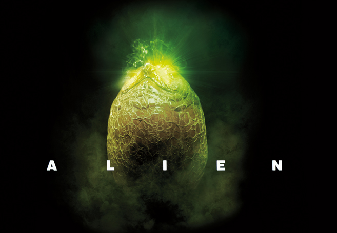
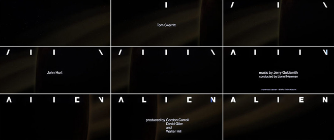
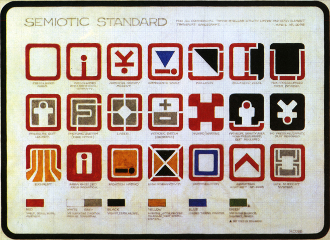
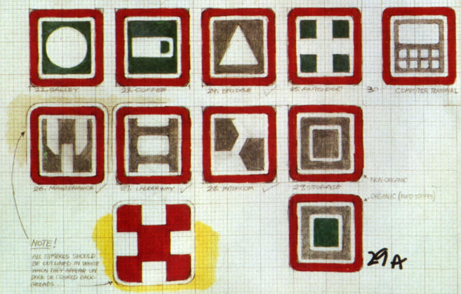
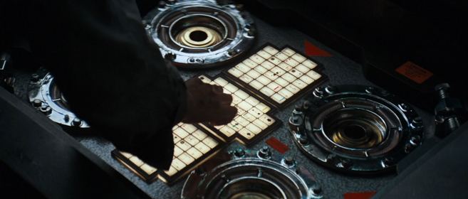
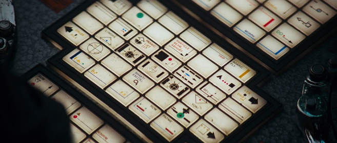
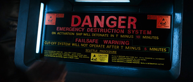
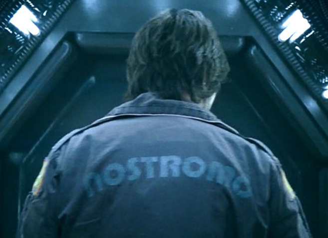
Dave Addey has a passion for typography and sci-fi films, which is meticulously demonstrated on his amazing website TypesetInTheFuture.com. His newest post published a few days ago provides a fascinating analysis and breakdown of the typography used in Ridley Scott’s 1979 masterpiece ALIEN. The detailed study of the film’s typesets is guaranteed fun for ALIEN fans, and the following is just one example of Addey’s terrific and entertaining insights: “Pump Demi was recently voted ‘Most 70s Font Of All Time’ by the International Font Council. That’s not actually true, but it might as well be. It goes to show that it’s very hard to know which aspects of a design will still look futuristic in the future. Pump Demi is also seen on the crew’s nameplates in the main Nostromo cabin. You can recognize it from its freaky capital Y, even when blurry.” You can read the ALIEN study in full at TypsetInTheFuture.com. Addey also breaks down the fonts of 2001: A Space Odyssey, as well as Duncan Jones’ 2009 film MOON. (Source: Kottke)
.


