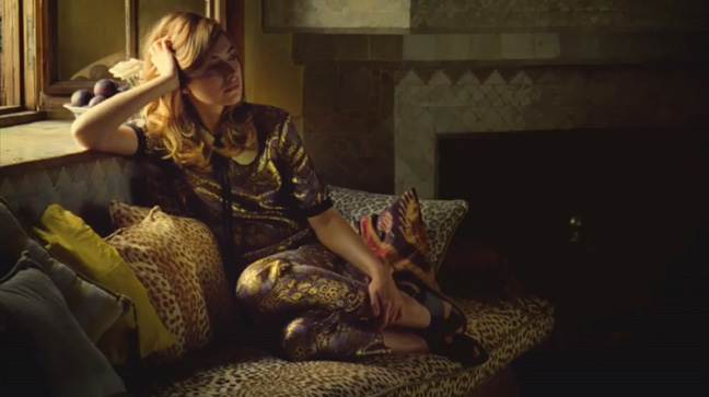
This week brings a brand new graphic look to FEELguide with the introduction of a cleaner, more minimal look to the banner. I’ve reduced the size of the logo which used to stretch 100% across the entire width to its new size of approximately 1/3 and centered in the middle, and I’ve kept the dark “Rorschached” image background which maintains the mood of the banner the further you scroll towards the bottom of each page. Each week the banner will continue the tradition of carrying a theme, which will not only be referenced in a subtle image on each side of the banner, but will also be embedded with a text explanation on the bottom right-hand side. And to kick off this new graphic chapter on FEELguide I’ve chosen a gorgeous new ad for H&M directed by the one and only Sofia Coppola. There’s no bigger fan of Sofia’s work than yours truly, and this brand new spot for H&M carries her signature atmospheric genre into the world of fashion. Enjoy Sofia, and enjoy the new look! To learn more about Sofia’s ad for H&M, including some behind-the-scenes footage be sure to visit The Playlist.
Banner Photo #66: A Fresh New Look For FEELguide
Brent Lambert
Writer, editor, and founder of FEELguide. I have written over 5,000 articles covering many topics including: travel, design, movies, music, politics, psychology, neuroscience, business, religion and spirituality, philosophy, pop culture, the universe, and so much more. I also work as an illustrator and set designer in the movie industry, and you can see all of my drawings at http://www.unifiedfeel.com.


