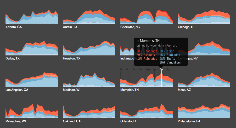
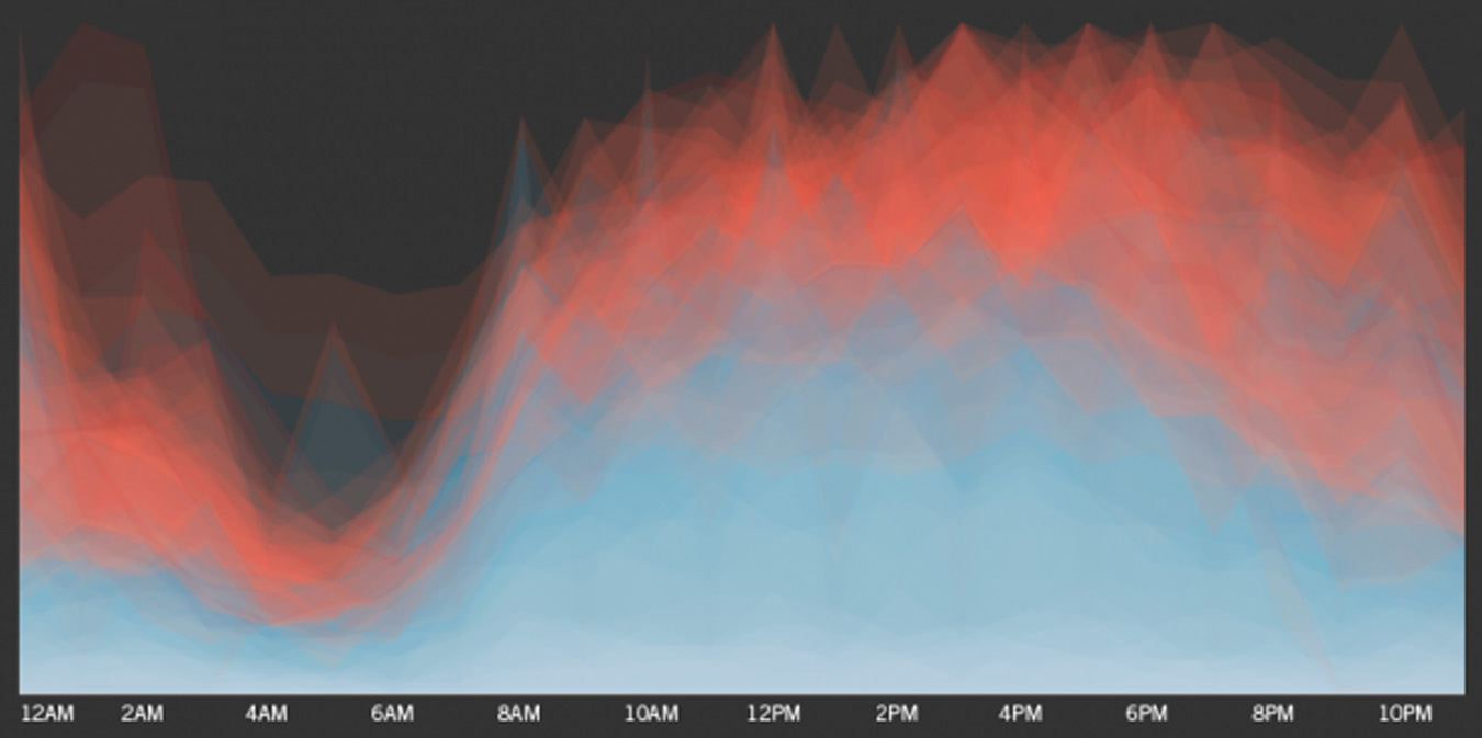
When I saw this HTML5 interactive infographic designed by Trulia I thought it was just about the smartest damn thing I’d seen all week. Trulia took crime data from SpotCrime.com (January 1 – 31, 2011) and built individual interactive breakdowns of various American city’s crime rates in a 24-hour period as you toggle over each city’s chart. The images below are just screen captures, but to jump into the real fun simply head over to Trulia by CLICKING HERE. My only criticism of this great piece of work is that it only represents one month of data. I would love to see them do a full year’s span in one batch as well as individual months for each city as well.

 Source: Public School

