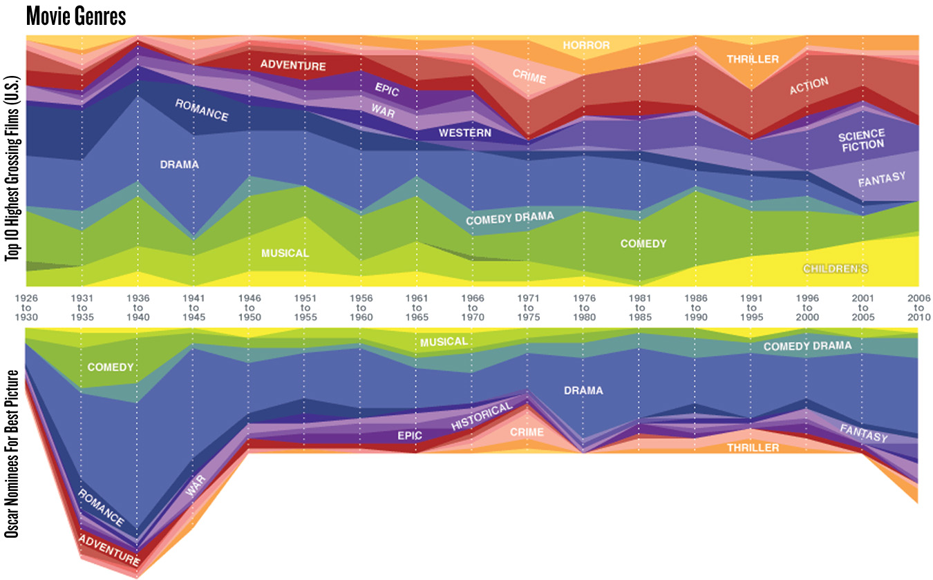
The films we watch the most and the ones we consider to be the highest quality has certainly changed through the years, and has come to serve as an interesting barometer of who we are. The following infographic charts the “genre pattern” of movies from 1926-2010 with regards to box office success and the nominees for the Best Picture of the year. The data reveals some fascinating items including the box office surge of children’s movies in recent years and the diminishing of dramas (although dramas seem to be the ones that get nominated for Best Picture the most). 1971-1975 saw a spike in crime films not only at the box office, but also for nominations. 1976-1980 saw a rise in box office success for horror films, while at the same time there was an increase in respect for dramas come award season time. Take a look below and see which patterns you can find yourself.
NOTE: CLICK ONCE TO ENLARGE, CLICK AGAIN TO ZOOM
 Source: Very Small Array via Kottke

