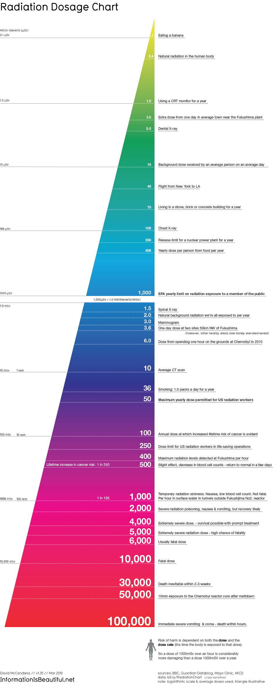
The disaster in Japan is horrendous, as is the Japan government’s handling of the crisis. One of the most outrageous moments came after the nuclear plant’s overheating required an evacuation zone to be set up around the site. As U.S. officials declared any American citizen in a 50-mile radius from the plant had to be evacuated, the Japanese government implemented a radius of less than 20 miles. Then they kept shifting it when things started getting worse. Unbelievable. The radiation that has been leaking out has made its way to various parts around the world and has freaked out countless people concerned about exposure to the dangerous invisible energy. The infographic below should finally put some of these concerns to rest, as it reveals how silly the concern is in the first place. It’s full of fascinating tidbits that show us how much radiation we encounter in our daily lives compared to what we’re getting from the Japan blast. You can also click on the image for a closer look, and click again to zoom.
 Source: Public School

