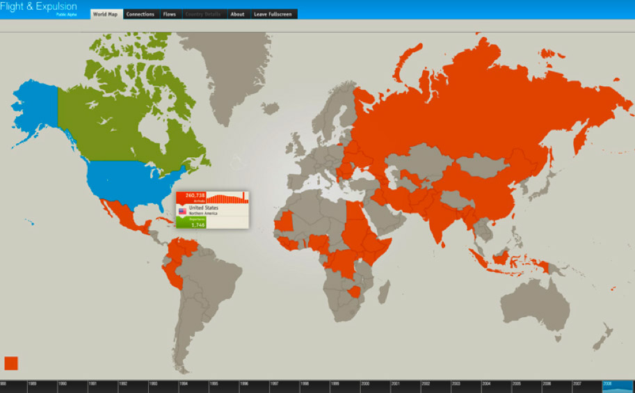
I found this brilliant infographic today on Niceone’s website. It’s an interactive map showing the world and the movement of refugees from country-to-country (i.e. each country has “Arrivals” and “Departures”). Click on the year on the bottom that interests you, then move your cursor to the country you’re interested in to get the stats.
Click HERE to see the map.
Source: Niceone


